Superheroes and their costumes. A great costume design can go a long, long way towards character success. An iconic, visually striking look is really important. You ideally want a suit that sticks around for years and years, to the point that it becomes iconic (ie Superman, Spider-Man, Wonder Woman, Captain America). What you don’t want is to do what a whooooole lot of creators have done over the years, and that is to ‘fix’ what isn’t broken.
Nobody is immune. Spider-Man, the Flash, Green Lantern, Iron Man… at some point they’ve all had a look that could be kindly described as ‘head scratching’.
While it works out for the better sometimes (and we’ll get to that list at some point), many times the results are… cringe-worthy. In fact, there are so many bad ones that this list could go on for a long, long time, but for now we’ll stick with the top (bottom) 10…

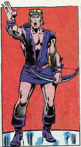
10. Hawkeye
….wow.
Clint Barton is undeniably brave. As one of the all-time greatest Avengers despite not having any superpowers he’s demonstrated this time and time again. But to walk outside wearing this shows a level of not giving a crap that is frankly staggering.
Clint’s had some pretty embarrassing outfits over the years (Goliath, anyone?), but this takes the cake. It actually seems like it would make his job even harder. And the skirt… I have no idea who thought this was a good idea.
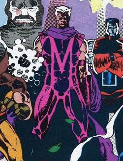
9. Magneto
When Uncanny X-Men 200 rolled around, the big status quo shift was Magneto realized he had been going about things the wrong way and switched to the side of the angels, filling in for Charles Xavier as head of the Xavier Institute. And to signify this drastic character shift a change in costume was called for.
No longer requiring the telepathy proof helmet since he wasn’t going against Xavier anymore, he decided to ditch the whole ‘iconic uniform’ mess and go for a purple onesie with a giant ‘M’ across his chest (for ‘Mistake’? or ‘Magneto’?). Also, he threw in arm bands and elbow high gloves for good measure.
This outfit is as good a reason as any for humans to hate and fear mutants. Well, hate, at least.
Thankfully this mess didn’t stick around too long.

8. Aquaman
Aquaman has had a hard time being taken seriously at times over the years, and the above did absolutely, completely fuck-all to change that. I get the idea of using water-like colors for a water-based character, but for a guy that often had problems standing out in a crowd with the likes of Superman, Green Lantern and Wonder Woman, I’m not sure making him blend into the scenery even more is a good move.
There doesn’t even seem to be any real reason for it. Who is Arthur hiding from in the water? Who does he not want to see him? He’s the freaking king of the ocean! The classic look (with some variations, of course) has stuck around for 70-something years for a reason!

7. Captain America
Holy hand grenades.
To be fair, I could easily have used the Nomad outfit, or Cap Wolf, but something about the armored look really doesn’t sit right with me. Maybe it’s because it was featured in some really, really awful Captain American comics, but it just seems against grain for the character. Almost seems like Steve’s hiding, which is not exactly what Cap is known for.
To make matters worse than the fact that he’s wearing shiny armor, it seems to have muscles carved into it. So that happened. Also the shoulder pads look like they make it super easy to maneuver quickly and THROW A SHIELD. Really well thought out design work, there.
The worst thing might be the helmet/mask. The whole face is wide open except for a metal bridge that goes across his nose. “Oh, please, please break my nose. This will make it way easier for you!”
Generally it’s a good idea to stick with Jack Kirby designs, or at least just slightly modify them over time. But this goes against everything great about the iconic, decades-lasting uniform Cap’s rocked pretty consistently since 1941. Fucking booooo.

6. Wonder Man
I flipped around a little bit on this one, for a few reasons.
- Not a ton of people know who Wonder Man even is, much less what he looks like normally, and
- He had the leisure suit look in the 70’s (and for some ungodly reason during Brian Michael Bendis’ “Mighty Avengers” run) that might have been even worse.
It’s not a good look. The Christmas colors, the W and the inverted W on his chest with the Christmas star of yellow in the middle just looks awful. Not sure what’s going on with his boots, either, but they look pretty ridiculous.
Finally, the jet pack. At times over his history Wonder Man (Simon Williams) has been able to fly unassisted and at other times not. There isn’t always great consistency with how he’s portrayed, short of ‘he’s really, really strong’. Personally, I prefer the version that can fly without an exterminator pack on his back.
Really picture someone wearing this and you will see how awful it is. Just like…
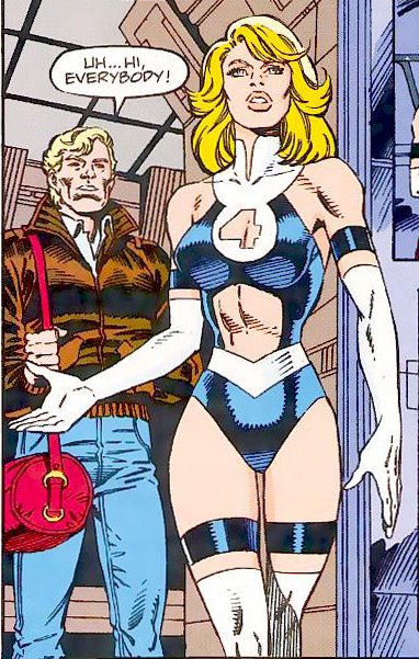
5. Invisible Woman
Man, I hated this when I was a kid. The Invisible Woman was almost like a mom figure to a lot of readers, so this sudden shift in her appearance was a bit like seeing your mom dressed like… well, like that.
There are some elements of a good design here, but the overabundance of skin for skin’s sake (what possible function does the 4 window on her chest, the open stomach, and bare thighs serve? Especially for exploring?) is pretty ridiculous, and completely contrary to the character’s portrayal for the previous 30+ years.
It was a somewhat odd era for the FF. Reed and Doom had very recently been killed (or so it seemed), Ben was sporting a metal helmet to cover scars caused by a fight with Wolverine, Johnny was married to a Skrull posing as Ben’s ex-girlfriend Alicia Masters, an adult version of Reed and Sue’s kid from the future was hanging out, and then all of the sudden mom removes like 70% of her clothes.
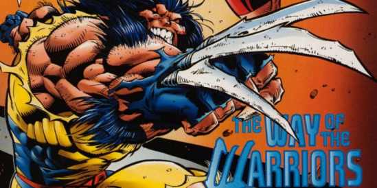 4. Wolverine
Just… just make it stop!
Wolverine’s design has changed very, very little in the 40+ years he’s been around, with one major exception. This… thing.
While I have no problem with the bone claws- they are super gross and awesome, just not as cool as the adamantium ones- I do have a problem with pretty much everything else. The lack of a nose, the fingernails that are suddenly, inexplicably long and crusty, and the hilarious amount of forearm hair are all pretty bad ideas on ANY character, but on one of your flagship, cash cow characters?
What was Marvel thinking? This has GOT to be the worst they’ve done…

Fingerless gloves, no nose, and caveman teeth. Wolverine, folks!

3. Thor
… or maybe not.
Do I even need to explain ANYTHING about why this is a bad design? Why it takes what worked for decades and learns ALL the wrong lessons, then applies them hilariously?
The form-fitting bib/muscle tee is pretty hysterical, I’ll admit. But this is just embarassing.
There was another design in this era by the incredible Mike Deodato Jr, but even that has some rather serious missteps.
What did Thor have against haircuts and complete shirts in the 90’s? Or common design sense? Or taste?

so many straps! so much hair! shoulder pads! straps, straps, and more straps! codpiece! hair! half shirt because full shirts are for pussies! Thor!

2.Wonder Woman
A lot would point to the Denny O’Neill era Diana in the 70’s: the powerless, kung fu spy Wonder Woman. While I can see why some people really don’t like that version, I kind of dig it as an alternate to the traditional Wonder Woman.
This, however, is just stupid. It’s not that it shows more skin; Diana has never had a problem beating the living bejeezus out of her foes in what is essentially a partially-armored one-piece swimsuit. It’s that she doesn’t look like Wonder Woman anymore. Sure, there’s the logo and the stars on the shorts (…why?), and she has the bracelets, but she’s basically wearing a bondage bra and bike shorts with leather gloves. A lot of black leather (or black spandex, maybe) in this costume.
It’s not a bad design, necessarily. It could work on some other characters pretty well. But it just seems beneath Diana; like she’s slumming it. Boo-urns.

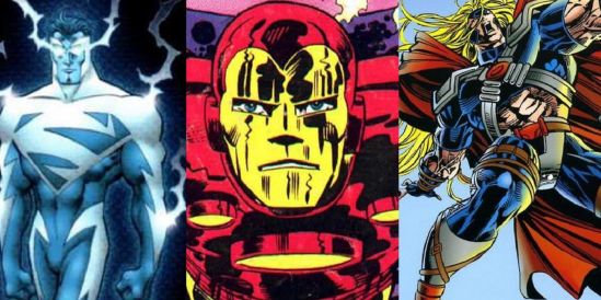
1. Superman
I hate this. I hate it, I hate it, I hate it. Ooooooohhhh, I hate it.
There is no reason to redesign Superman. His look, powers, etc, all of it worked on every level for decades and decades. It wasn’t broken, but DC took a chainsaw to it to ‘fix it’. Gone were Clark’s traditional powers, now replaced by energy manipulation. His skin turned blue (then red), and he was essentially a being of pure energy. He could even travel along energy wavelengths like Electro.
Sound like Superman yet?
While I have no problem with creators shaking things up for the sake of their story (some of my favorite stories ever have ‘replacement’ versions of the hero), the level of stupid this reaches (for me, at least. I actually know someone that likes this mess) is so high, even Superman would have trouble reaching it.
For shame.
***
That’ll do it! There are so, so many more to choose from (Steve Rogers’ Nomad costume is pretty hilarious), but for now these are our top 10. Let us know what you think in the comments, or if you have your own ideas!
Hell, we never even mentioned the Iron Man armor with the nose on the face plate…